
Many realtors use virtual staging services to boost their sales rates. But they often struggle to tell pro staging from amateurish. They might not know how photorealistic staged images can be and, as a result, they settle for rather mediocre quality. Needless to say, those pictures do nothing to help real estate agents with their sales.
So, it is crucial to choose a pro virtual staging company that will provide the desired results. Those should be photorealistic staged images that will prompt potential buyers to request a property visit the moment they see it online. Nothing less, nothing more. Now, let’s learn how to distinguish pro virtual staging from amateurish to never make a mistake again.
#1. Professional Interior Design
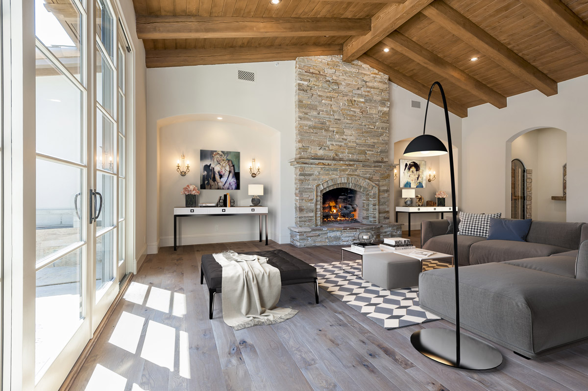
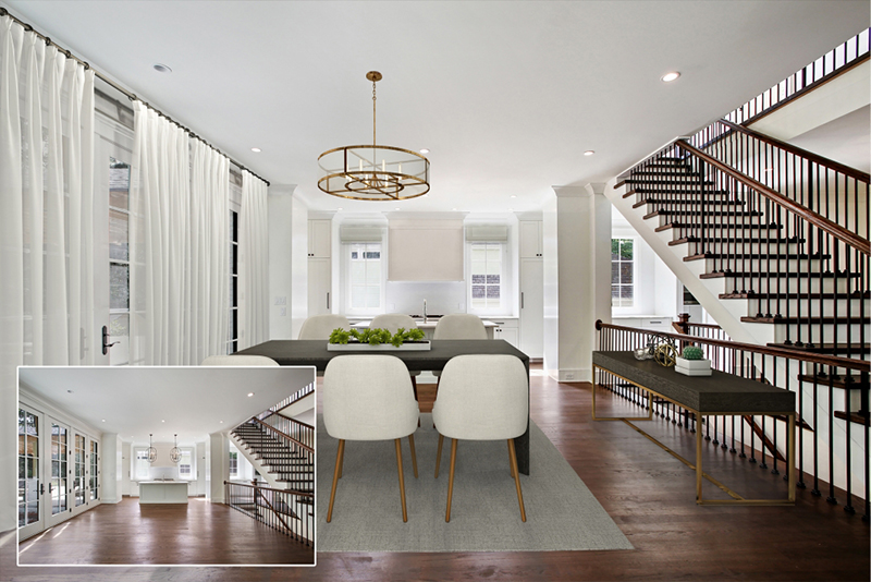
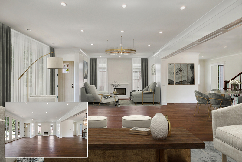
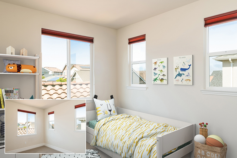
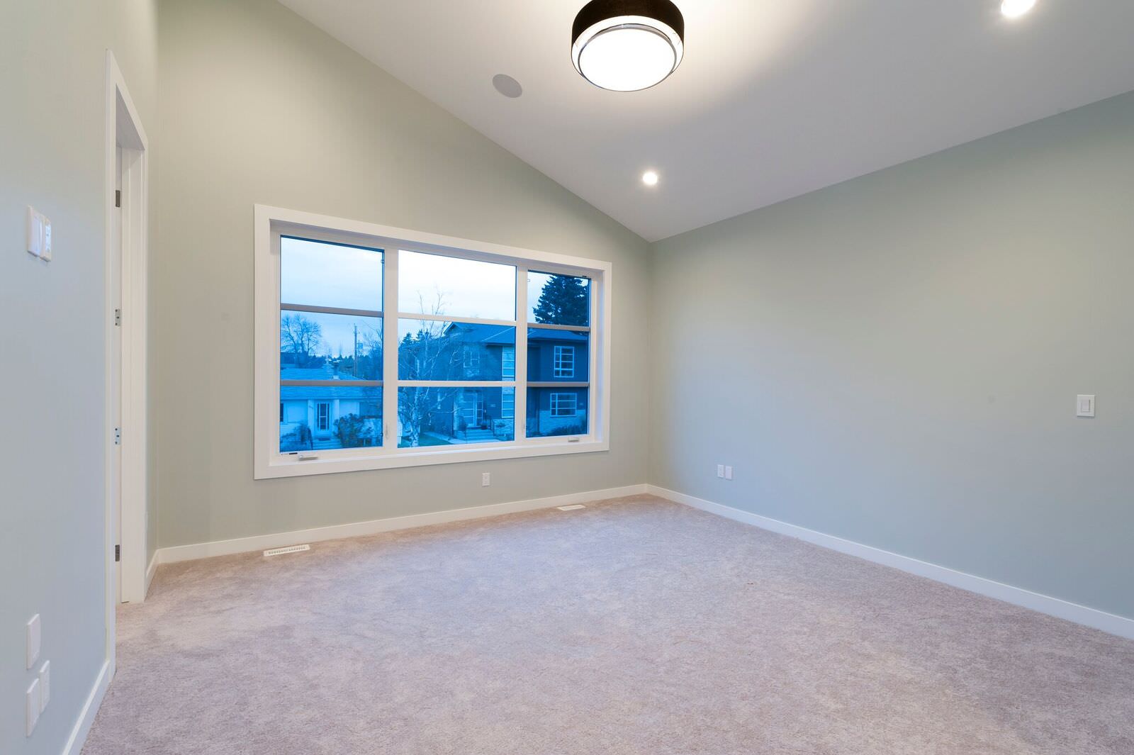
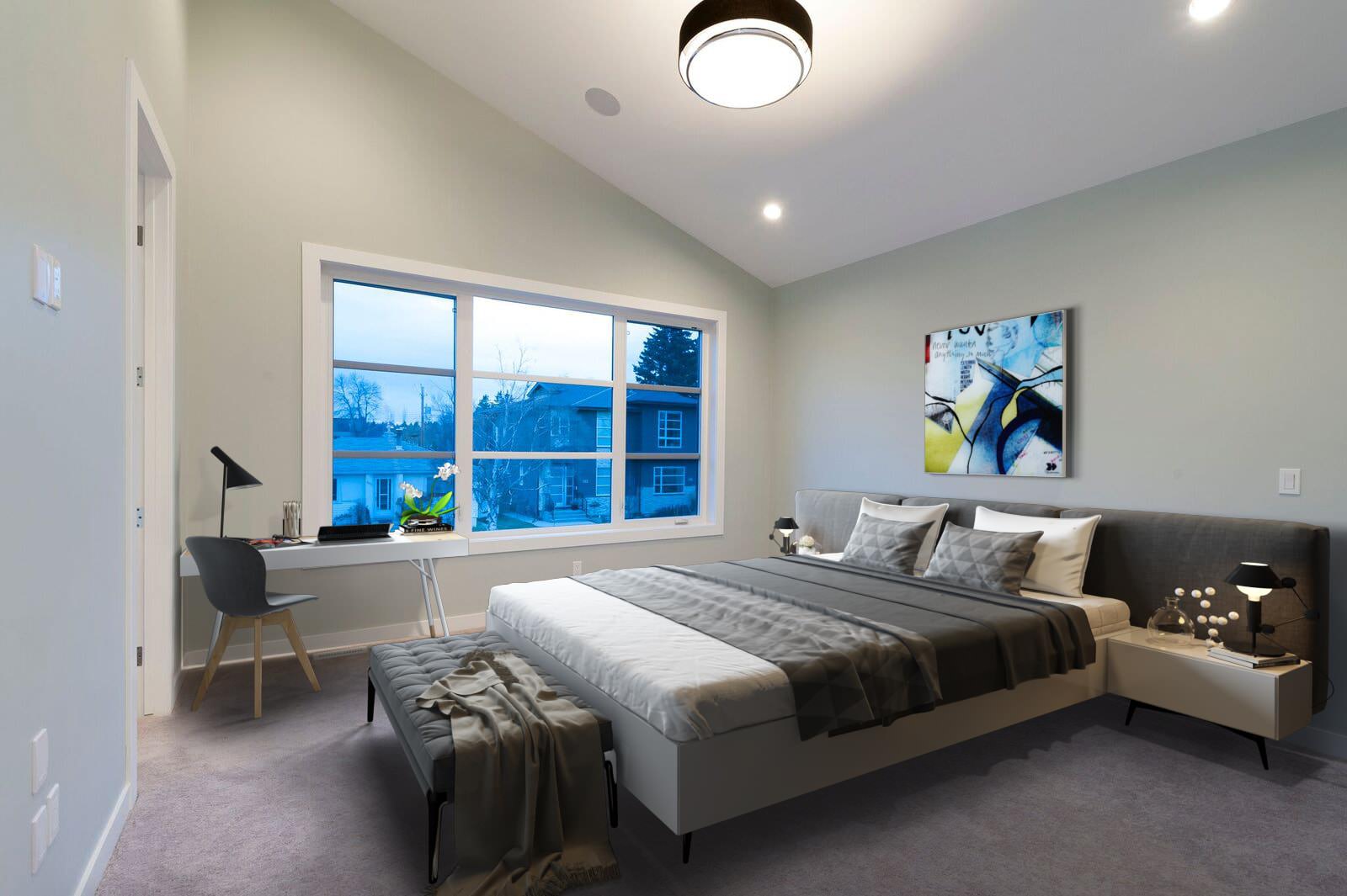
The number one difference between pro virtual staging and amateurish one is the quality of interior and exterior design. In a professionally staged image, all the furniture and decor items are chosen carefully and look good together, creating a certain style, a mood for the place. That is because pro virtual staging companies either employ design specialists or train their 3D artists in interior and exterior design. In the case of amateurish staging, the items are often mismatched and don’t give the room a finished look.
When browsing through portfolios of virtual staging companies, realtors should remember that the task at hand is not just to fill the space up. It is to make beautiful pictures to attract the attention of potential buyers. Not everyone has a perfect taste naturally, but simply asking oneself if a staged scene looks good and realistic is the first step in telling pro virtual staging from amateurish.
#2. Furniture and Decor Scale & Quality
Furniture is what we see first in a virtually staged scene, and it takes up most of it. So, if something is wrong with the furniture, the picture is automatically ruined. One thing is the proportions. The objects must be scaled according to the actual dimensions of a room they are placed in, and regarding each other. So, if the furniture in a staged image looks too big or too small, it definitely wasn’t done by professionals.
The other thing is the quality of the items in a scene. Basically, those are all 3D models. In the case of pro virtual staging, every object looks highly photorealistic. But amateurs often use 3D models that are low-poly (meaning, not very detailed) or have wrong geometry. Or both. It can always be noticed with the naked eye and is likely to give the prospects a negative impression about the property offer in general.
#3. Materials and Textures Scale & Quality
This issue is somewhat similar to the previous one, only here it’s all about materials. Textures are what makes the 3D objects “come to life”, so they need to be of high quality, scaled according to the size of the objects that they are applied to. If they aren’t, a realtor might get an image where the staging items look somewhat realistic, but also a little weird. And when one takes a closer look, it becomes clear that the textures are all wrong.
For instance, they can be stretched too much, the patterns might be disproportionate or too blurry. The materials are likely to be indistinguishable. In the case of pro virtual staging, on the other hand, the materials always look realistic enough for one to imagine what they feel like to the touch. This is the quality standard of professionals, and this is what realtors should be looking for when choosing a virtual staging company.
#4. Realistic Color And Lighting Blend
If staging items look like they’ve been cut out from a different picture or taken from an old computer game, it’s not good at all. It might’ve have been fine 10 years ago, but modern virtual staging has much higher standards. First of all, the lighting in the final image should match the original photo. The light from the windows must be considered when filling the room with objects, with all the shadows and reflections in place.
Then, the colors should be in harmony with each other, with no single object standing out in a scene. It is better if the color palette is neutral because the goal here is to highlight the best features of the property and not of the virtual items. But don’t worry – pro virtual stagers know how to add decor pieces and color accents in a subtle way, so that the image doesn’t look too bland.
#5. Too Much Of A Good Thing
Well, it should be rather obvious that CGI should be used in moderation, however great it may be. Again, the idea here is to inspire people to buy the property, and one shouldn’t lose this focus while doing virtual staging. So, if the property is looking unrecognizable in the staged image, it’s definitely not helping the cause. Pro virtual staging specialists always know their limits when it comes to particular types of services.
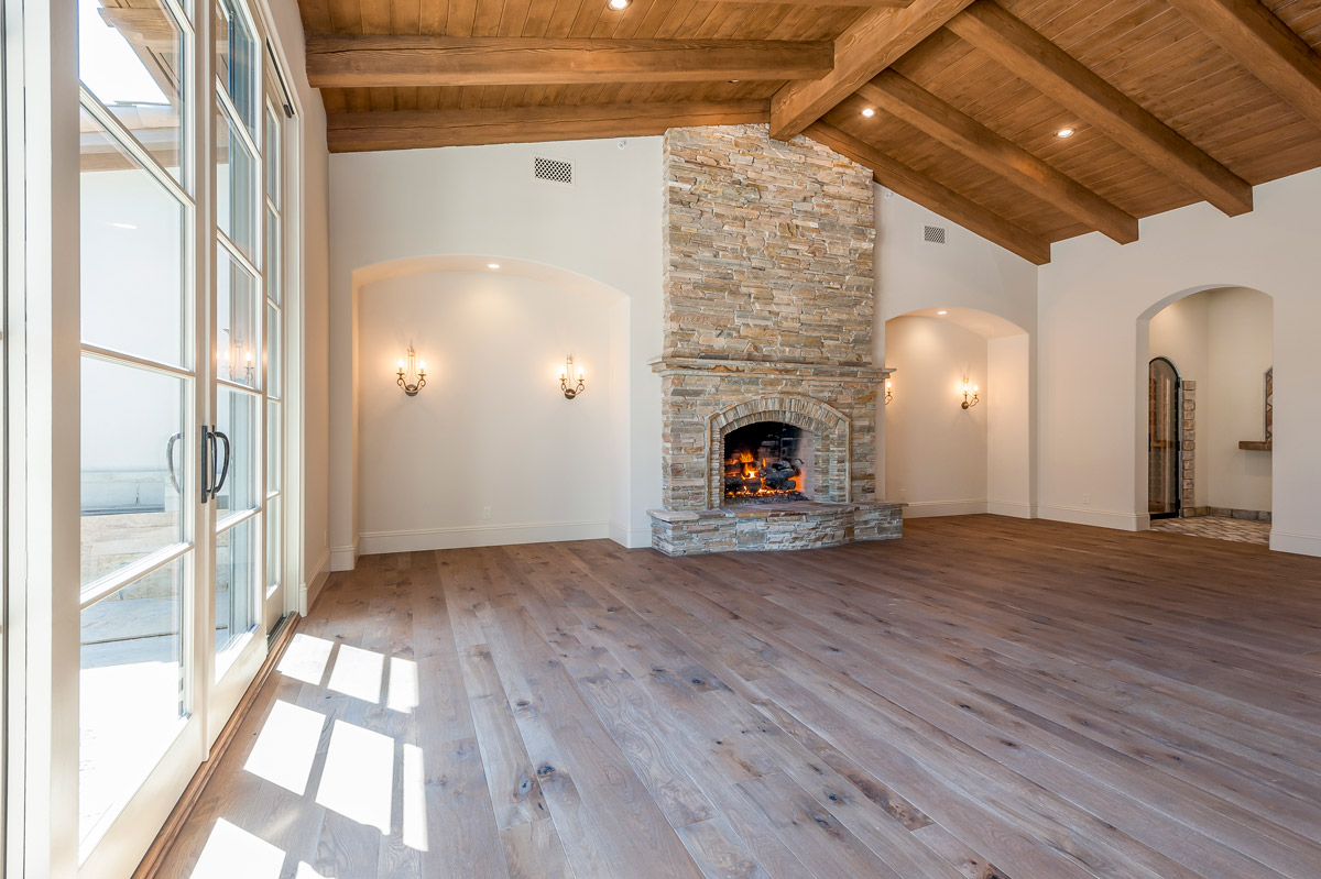
There is, indeed, such thing as virtual renovation, but it is a whole different story. In this case, it is possible to do more than just furnish the property, but it should always be labeled accordingly. So, if a realtor asks for virtual staging and receives a picture with repainted walls, brand-new windows and a fireplace that’s come out of nowhere, they should demand a full refund and never contact that staging company again.
Those were the 5 main things that allow to distinguish pro virtual staging from amateurish. Overall, realtors should pay close attention to the design itself, the quality of CGI and the ability of virtual stagers to highlight the best features of a property without overdoing it. Apart from that, something that really helps to tell good examples of virtual staging from bad ones is putting oneself in the buyer’s shoes. It can help to understand what images make people want to buy places, and what don’t.
Are you interested in using pro virtual staging services to boost your real estate sales? Contact us at ArchiCGI and get the top quality results in the shortest time!






Leave a Reply
Want to join the discussion?Feel free to contribute!